ui design
CookBook
Organize, customize and share all of your favorite recipes in one place, bringing back the tradition of the recipe book but in a digital way to go back to home cooking. UI design of a recipe application.
Project overview
Individual project
Interface design
Role
UX/UI Designer
Duration
8 weeks
Tools
Figma
CHALLENGES
The challenge of the project is to create an interface for the CookBook recipe app, designed to make it easy for users to organize and manage their recipes. Emphasizing the act of sharing, CookBook allows you to publish and share recipes, inspired by the tradition of exchanging cookbooks and culinary knowledge.
OBJECTIVES
Apply knowledge of composition and grids
Introduce styles, colors and typography
Consider the basic navigation structure
BENCHMARKING
There is a lack of a simple and customizable system for organizing recipes.
Competitors focus on discovering, rating and sharing recipes from users who have the option to save them.
Features considering the market
Search by filters so that the user can find recipes based on their characteristics.
Categories for recipes sort recipes
Tags, non-exclusive organization system
Favorite recipes section
Recent recipes
Ability to scan the recipe on paper and convert it to digital text
Import recipes from internet, social networks or other applications
Publish recipes in the application
Option to create combinations of recipes and save them for when needed (example: starter, main course and dessert). It is not a calendar or menu organizer, it is a grouping of recipes regardless of category and labels to have it at hand.
MOODBOARD
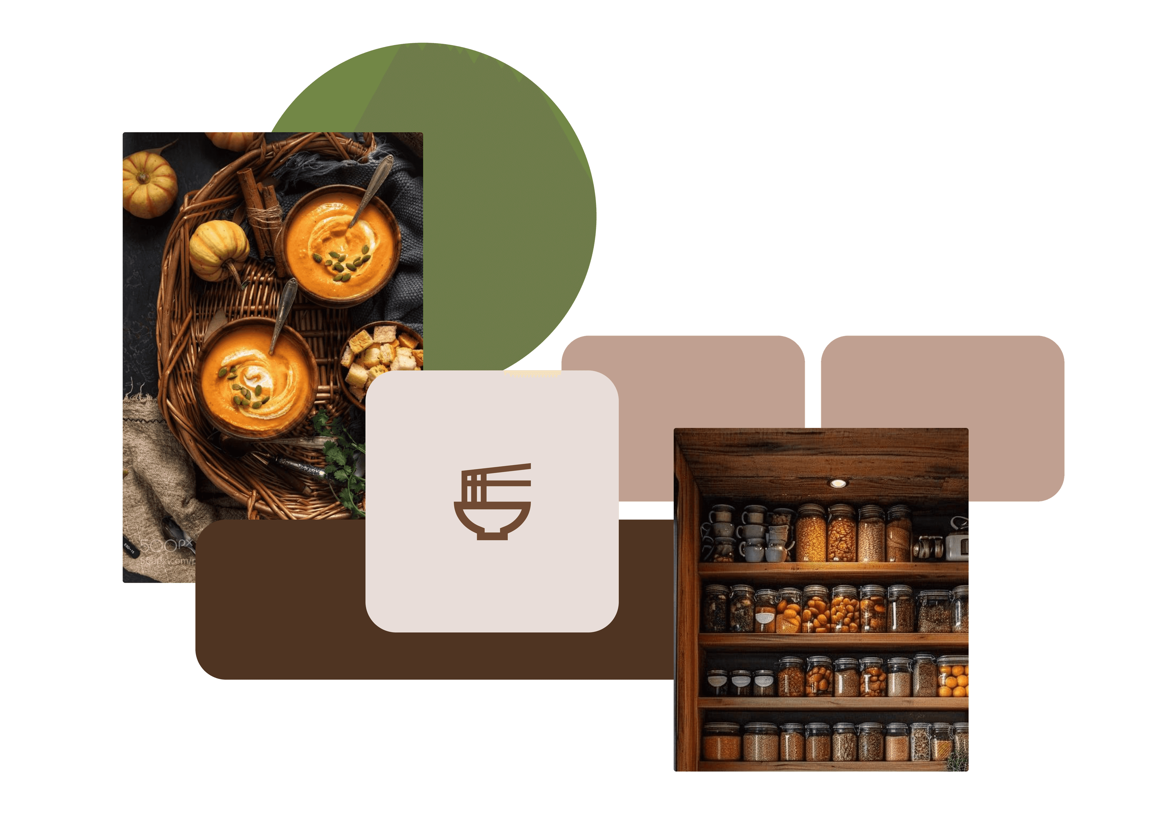
The traditional kitchen generates a sense of comfort, inspired by earthy and rustic colors I refer to home cooking and the habit of saving recipes to share with friends and family.
Warm and cozy colors combined with modern and simple elements, seek a relaxed and organized aesthetic for the application.
SKETCHES
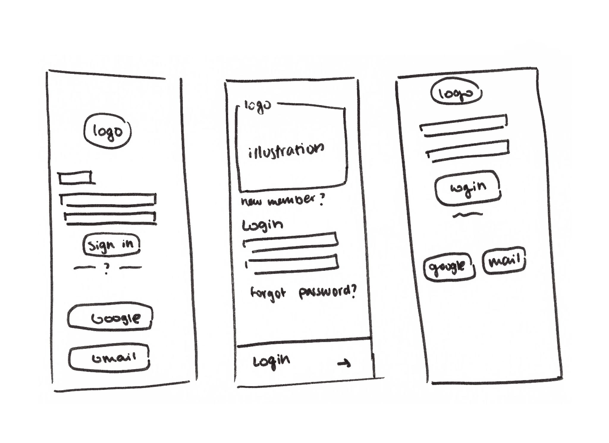
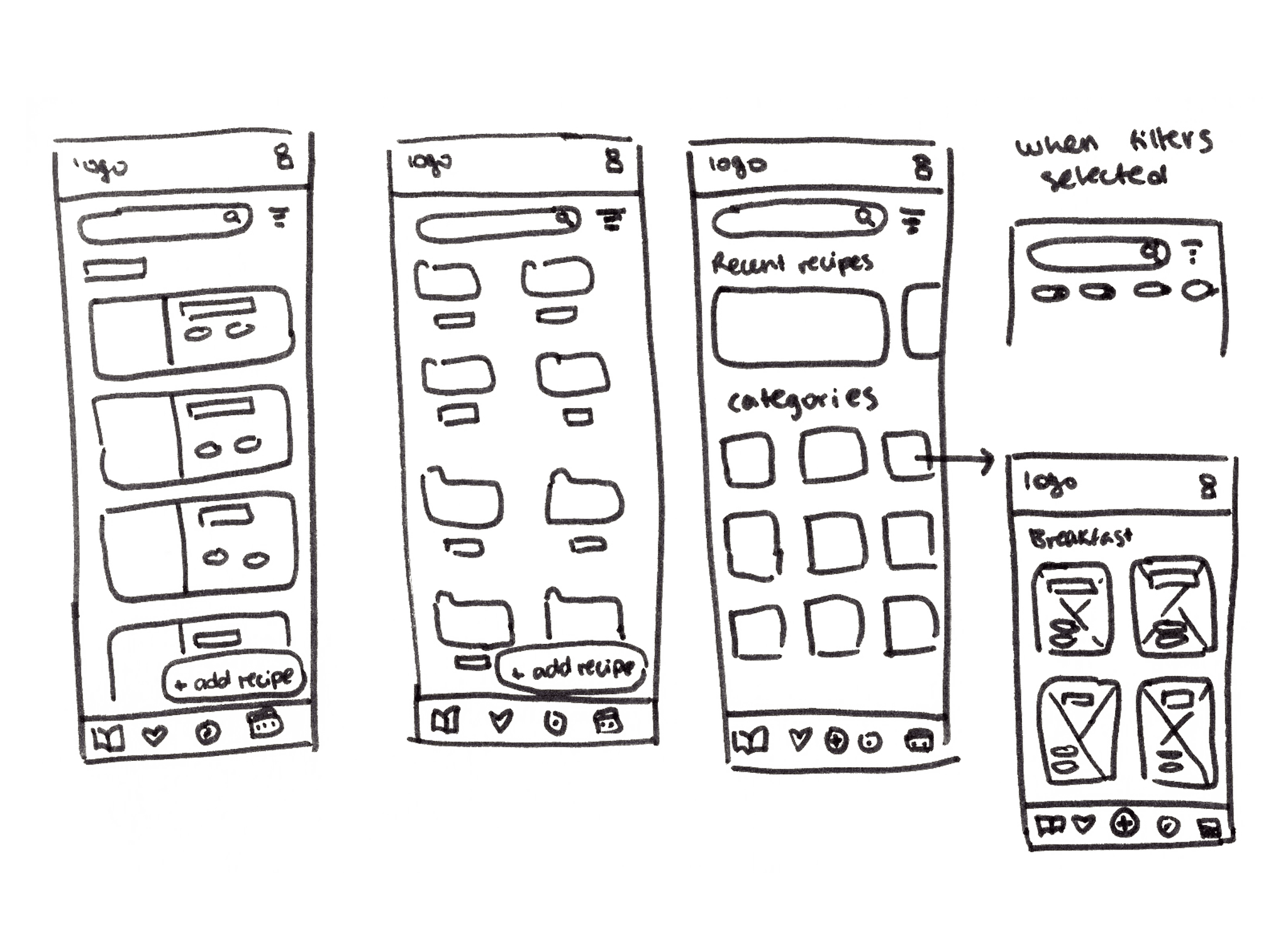
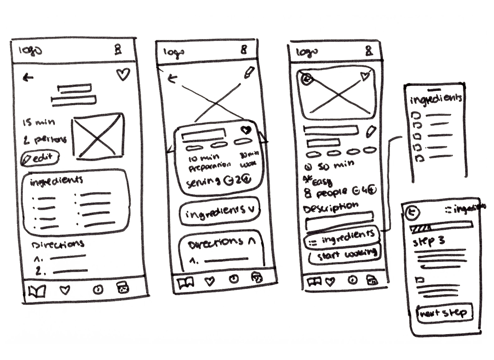
Generate compositions and draw by hand to encourage creativity during the ideation of key screens.
I sketched different variations of the registration screens, startup and a recipe in detail and then worked on them in the low-fidelity wireframes.
Sign in
Home
Detailed recipe
LOW-FI WIREFRAMES
CookBook: organize, customize and share all your favorite recipes in one place
Cookbook is an application designed to help users organize and manage their recipes in a simple way using customized filters. Once the recipe is scanned or imported, it can be categorized according to the user's needs. It includes a favorites section and a section for creating and customizing recipe combinations.
UI KIT
Investing time in creating a design system will help in the following steps of the project
For the high fidelity wireframes, apart from creating the style guide, I have designed all the components with variants to be able to modify them easily and ensure consistency in the application.
HI-FI WIREFRAMES FLOW
All actions are important
From the high fidelity wireframes I have detailed the different actions of each screen to make sure that the prototype contains the different tasks and flows that the user can perform.
USER FLOWS
Design smoothly, efficiently and logically
I have created three user flows which map the path that the user follows when interacting with the application, these define the most frequent actions that can be done.
PROTOTYPE
First prototype of many to ensure a good user experience
The CookBook preview can be viewed in the video where you can see how the tasks defined above are performed, or by clicking on the button.
NEXT STEPS
Test, iterate and redesign for improvement
Testing
The first step would be to test how users interact with the first prototype to identify improving areas in usability and interface navigation.
Design iteration
Based on the feedback and insights obtained from the usability tests, adjust the design to optimize it.
Animation and microinteraction design
To provide a better user experience, animations would be created for key actions making the interaction with the application interface more intuitive and appealing.
REFLECTION
Facing the fear of the empty canvas
This project has been a lot of fun and I immediately found myself immersed in it, even designing more screens than I had planned at the beginning! Although I started a little reluctant because of the dreaded empty canvas, the process of ideation and creation has helped me to let go and to explore freely styles, colors, typographies and compositions. I would have made wireframes of those screens that I had not planned to design, as I was carried away by the project I wanted to make the UI design of the entire application but instead of following the process outlined at the beginning, I decided to make low-fidelity wireframes without sketching different compositions. No doubt I would have saved time doing some quick sketches to get an overview rather than trying out designs and combinations without a clear reference. You have to be a better friend of pencil and paper!
OTHER UX/UI PROJECTS
Product design projects