ux/ui design
Goodreads profile
HMW make the sharing and interaction experience for socially active users in Goodreads so that they can easily engage with the app’s community and exchange book recommendations and opinions ?
Project overview
Personal project
End-to-end mobile app design
Role
UX/UI Designer
Duration
10 weeks
Tools
Figma

Google docs
INITIAL PROBLEM STATEMENT
Goodreads is one of the most popular platforms among readers, however, it lacks an accessible, user-centric interface, making it difficult to navigate through the application due to limited and outdated customisation.
This affects frequent readers who want to track, organise and share book recommendations. The inefficiency of the interface can lead to loss of user engagement and loss of potential new users who turn to other apps because they cannot find what they need on Goodreads.
RESEARCH OBJECTIVES
Understand how users interact with the app
Understand how intuitive the navigation is for the users
Discover where and why the user have problems
Understand why other apps are starting to get more popular
DESK RESEARCH
Although Goodreads is highly rated, many frequent users find problems and frustrations that haven't been resolved with updates
Key findings
Organising books and shelves in a way that works for all users is difficult due to the limitations of the app
Book rating system is inaccurate (1-5 stars)
The current search system is general and makes it difficult to find books
Only written books are taken into account, it is not possible to rate or review audiobooks
COMPETITIVE BENCHMARKING
Goodreads users leave the platform to find another app that meets their needs and expectations
Compare different apps focused on the reading market to understand their strengths and weaknesses and find opportunities to apply them in Goodreads.
Key findings
Each of them focuses on one feature, being the differentiating aspect
Clear and organised interface
Customisable and personalizable elements for the user
Appearance of the app is important to keep users
INTERVIEWS
Frequent users keep using the app despite problems with the different features of Goodreads and the limitations they find in organisation, customisation, user interaction and search
The interviews have allowed me to gain a deeper insight by understanding the users' actions on the platform.
Claudia, 22 · Once a week
“I like to see books reviews to see if other people liked the book, then I make a decision”
Chris, 22 · Daily
“Searching specific editions is difficult in the app and introducing books manually is tedious”
Miriam, 22 · Once a month
“I find interesting seeing other people points of view and book preferences”
Lucia, 23 · Every 1-2 days
“Mostly I use the app to see what my friends are reading and discover new books to add to my TBR”
Mario, 23 · Weekly - monthly
“Adding a finished book to the library and share it with friends gives me an accomplishment feeling”
Carolina, 22 · Daily
“It helps me a lot to keep track of the books and keep organized my reading progress”
Key findings
Depending on the user's profile and personality, it gives more importance to some sections or others
Users who are part of the application's target group find books more easily
They use the app mainly for three purposes: to track their reading progress, discover new books or interact with friends
AFFINITY MAPPING
Interaction with other users or friends, the shelf system, search with filters, ratings and reviews are the most recurrent themes among users when defining their problems and needs
With the research data I was able to define common topics to prioritise the most relevant points to work on in the redesign. These are defined by the importance, usage and type of feedback given by the users, if everything is negative there is something to work on.
Key findings
Limited and rigid system which doesn't allow much customisation in the organisation of the books on the shelves
Interacting with other users or friends can be a challenge, users have trouble finding each other on the platform
Book rating and tracking system is simple and inaccurate
The search system often confuses users, making it difficult and tedious to do so
Non-targeted users have trouble discovering new books and recommendations
Current design feels cluttered, old and flat and distracting, creating a poor user experience
Review system can be difficult for users to interact with
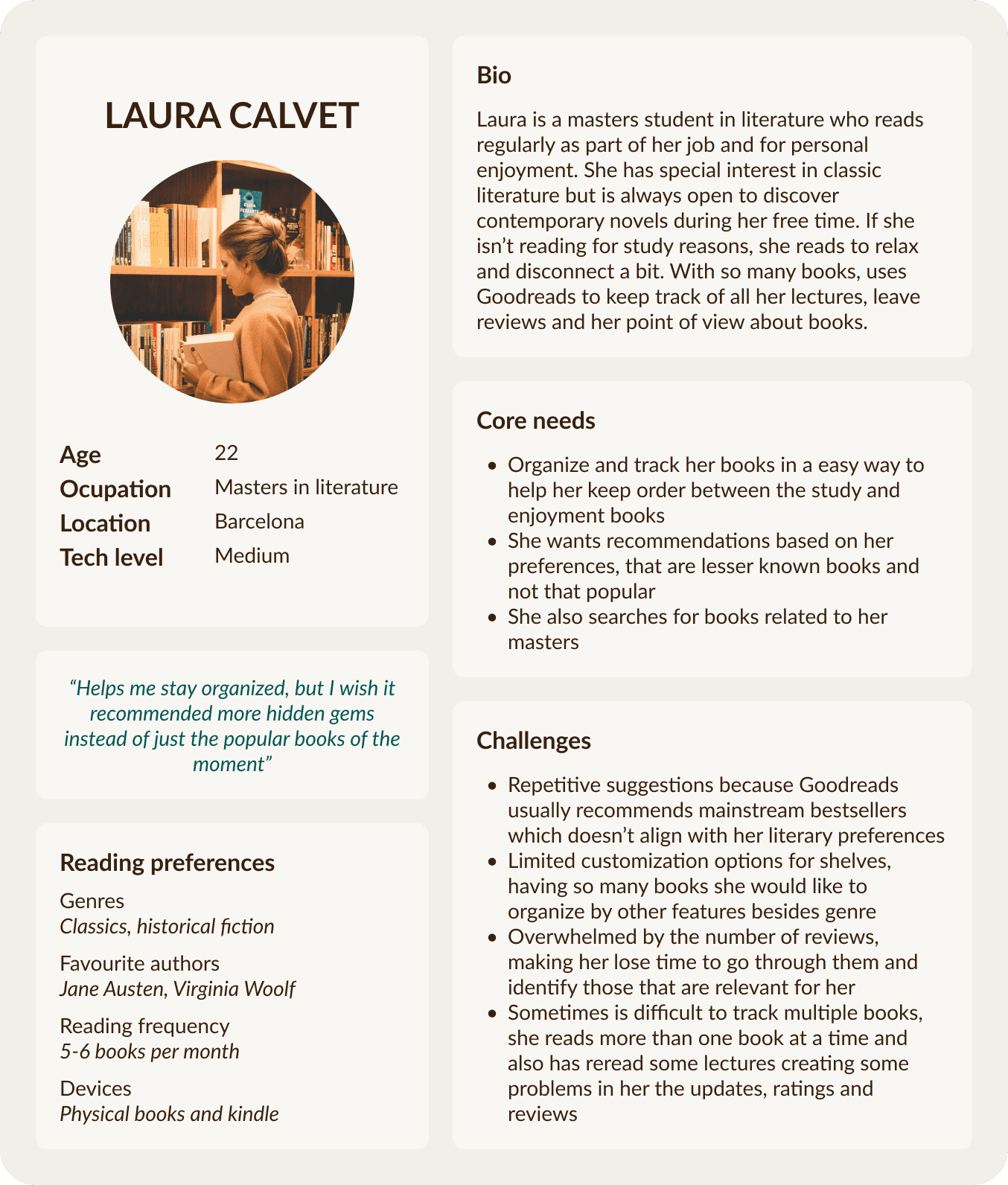
USER PERSONA
Regular readers who want to keep track of their books
Use Goodreads for organization and regularly update book progress.
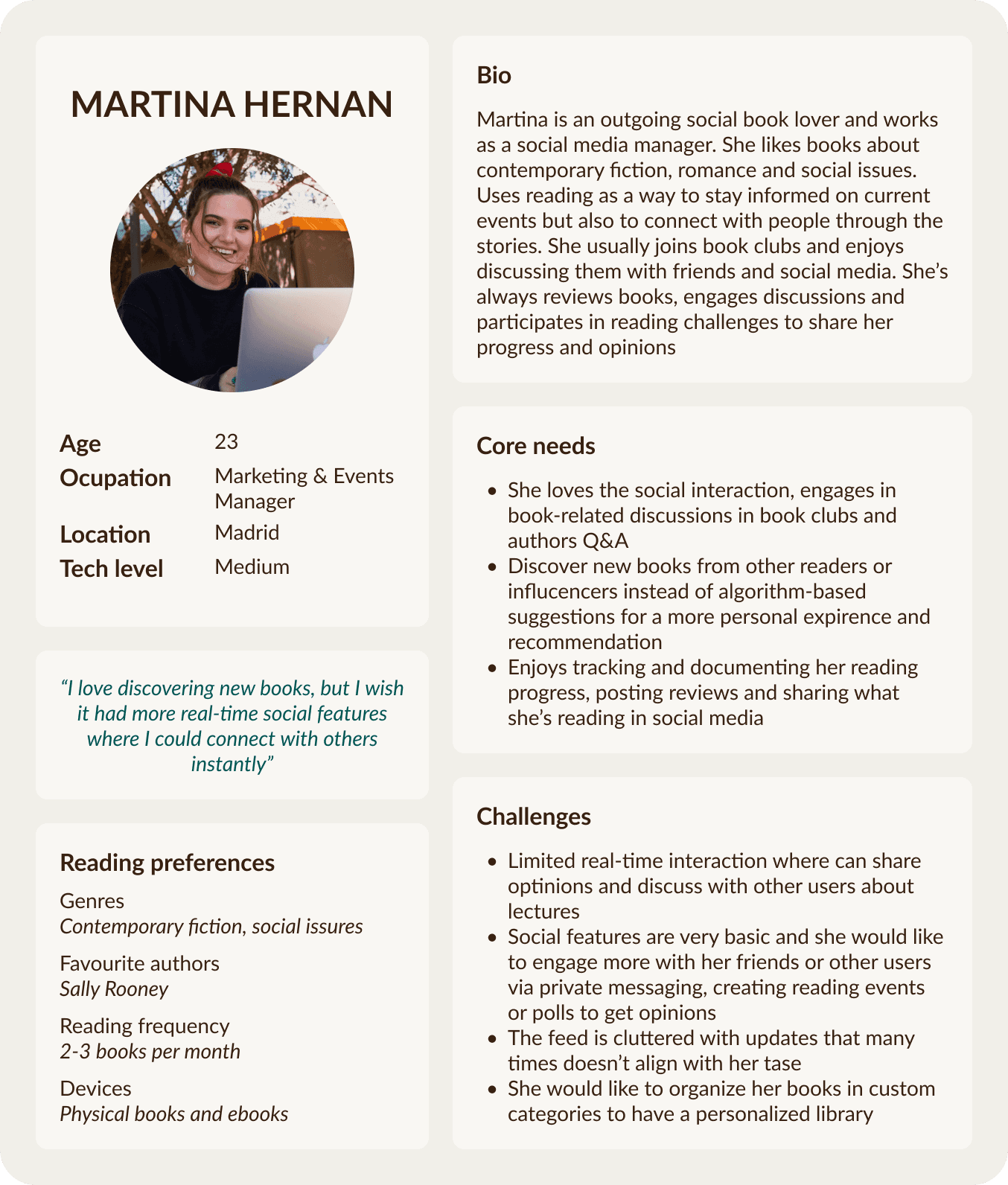
Readers who interact with the community of readers and like to discover new books
Find new books through recommendations, reviews, ratings and participate in discussions and groups.
INSIGHTS & HMW
From the research and the personas defined, I reframed the problems into questions to guide the ideation process through these new opportunities
HMW (how might we) is a method to turn problems into possible creative ideas encouraging innovative thinking through open-ended questions.
When organizing their book collection, frequent readers classify them according to their needs, causing the need of a flexible and customizable feature. This creates frustration by the limitations of the app’s rigid system for organizing bookshelves.
HMW improve the shelves system for frequent readers so that they can organize their book collections in a flexible and customizable way according to their personal needs?
When tracking and rating the books, readers track in a general way causing low details and vague descriptions about their lectures. This makes the record of their reading experience not accurate and the users feel disengaged to keep track.
HMW improve the tracking and rating system for readers so that they can provide more detailed and accurate records of their reading experiences?
(and that the rereadings doesn’t generate confusion or errors)
While writing and interacting with reviews, interactive readers often struggle to learn how to use the review system, write and change the font family or answer directly to other users in reviews, causing them to don't use the feature that regularly. This makes that the social impact, interaction and richness of the app is reduced because of the lack of engagement of the users.
HMW simplify the review creation and interaction process for users that wants to interact with the community so that they can engage more regularly the social features of the app?
The large community of the app generates an exchange of opinions and recommendations, social active users usually struggle to share and interact with other readers making difficult to engage in the social features the app offers.
HMW make the sharing and interaction experience for socially active users so that they can easily engage with the app’s community and exchange opinions and recommendations?
Users who wants to discover new books or find specific titles usually use the search system, spending more time than necessary in the action. This makes them frustrated because it becomes difficult and tedious to find books.
HMW enhance the search system for users looking to discover new books or find specific titles so that they can complete the action more efficiently?
When using the app, frequent users navigate the app and it’s features, causing them to rely on the interface design to do the main actions. This gives special importance to the design to give users a good experience and enjoy fully the platform.
HMW change the interface design for frequent users so that they can interact with a more enjoyable and engaging user experience while doing the main actions of the platform?
When getting to know the app, new users usually don’t understand all the features at first, causing them to delete the app. This makes Goodreads lose potential users because of the poor introduction to the app.
How might we create a more user-friendly experience for new users so that they can quicky undestand how to navigate the main features of the app?
While all of the proposed questions address important issues that can improve the quality of implementation, the project focuses on the following:
HMW make the sharing and interaction experience for socially active users in Goodreads so that they can easily engage with the app’s community and exchange book recommendations and opinions ?
During the benchmarking, one of the strong points is the community as it generates a lot of interactions, as well as being the main objective of the app: sharing and connecting with friends to discover new books.
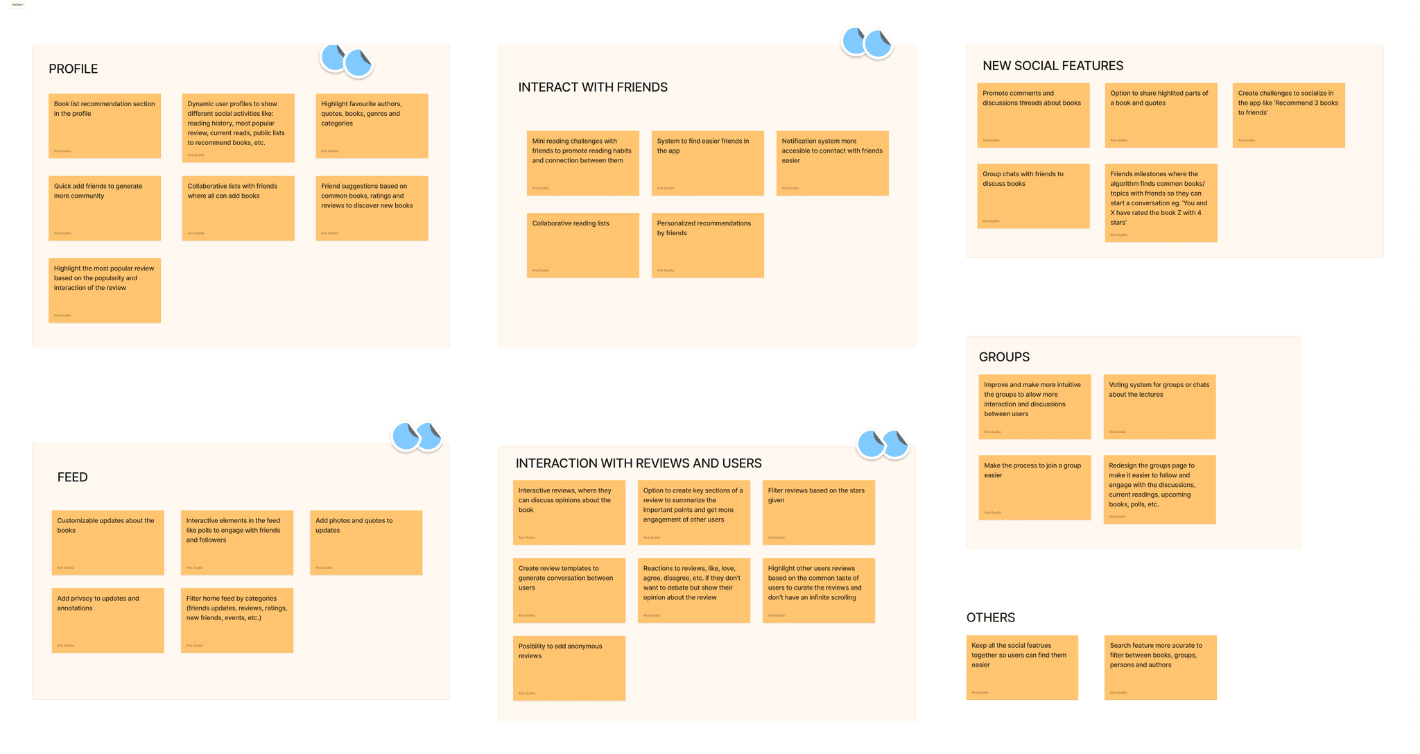
BRAINDUMP
The greater number of potential ideas increases the diversity of possible solutions for improvement
CLUSTER IDEAS
From all the proposals, I made groups according to the theme to define the solution and answer the HMW question
Redesign the profile to generate more interaction between users.
Improve the home feed to make it more user-friendly and interactive
Create more interaction in reviews
Introduce elements to improve interaction with friends
SOLUTION STATEMENT
HMW make the sharing and interaction experience for socially active users in Goodreads so that they can easily engage with the app’s community and exchange book recommendations and opinions ?
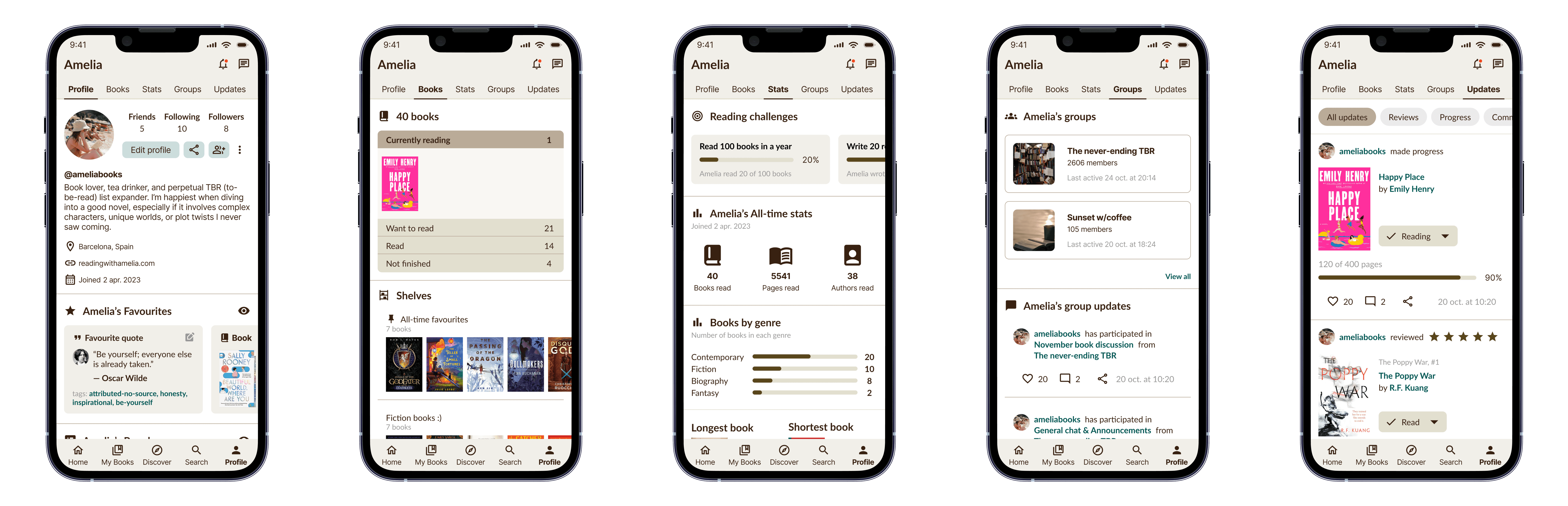
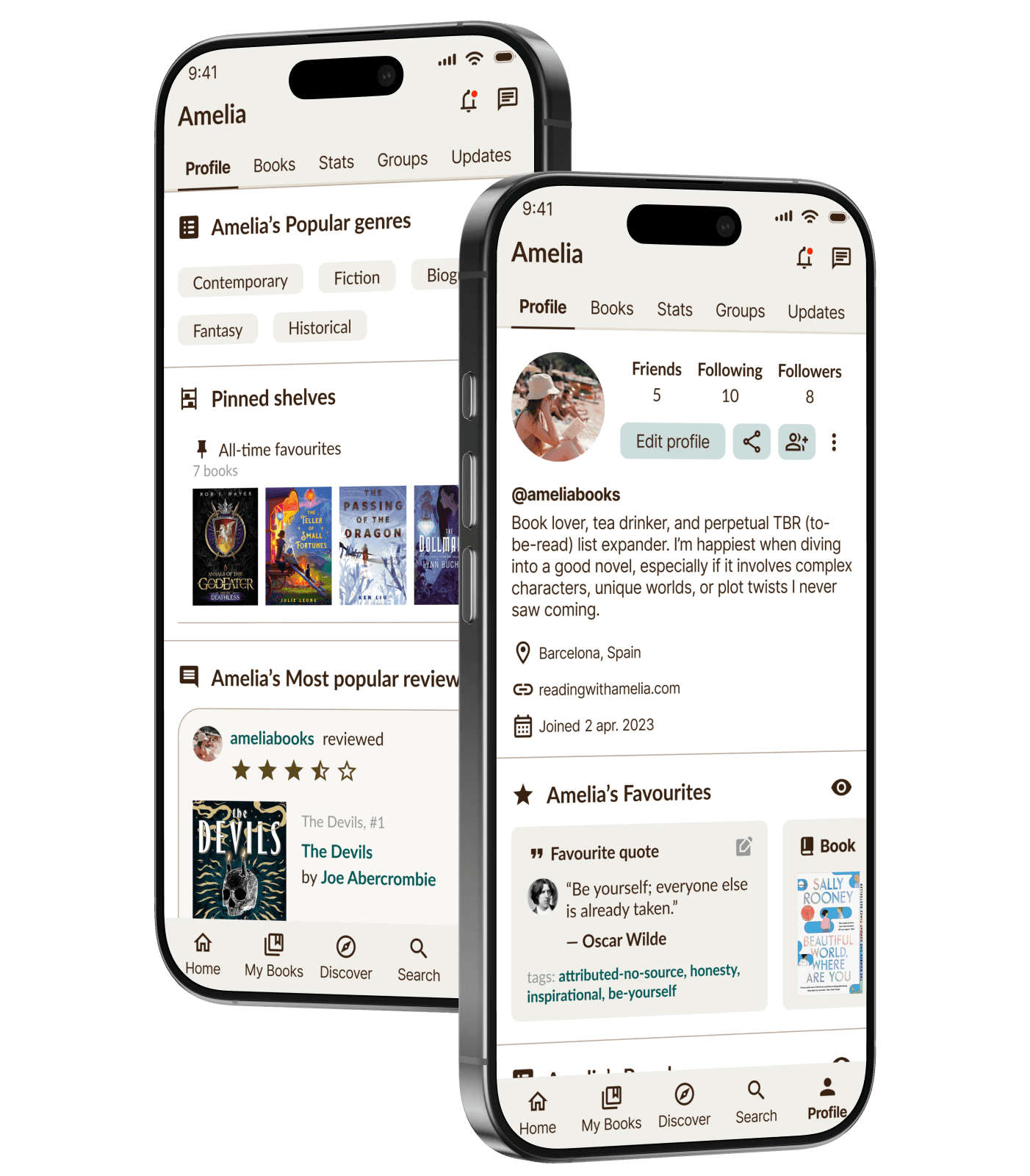
To enhance user interaction and engage more connections between readers, the proposal is focused on the redesign of the profile page based on the needs of the user personas. This will allow a more personalized and accurate profile to help different type of readers discover books by connecting with users with similar interests in a easier way. Additionally, the new features added to the existing ones creates a versatile profile depending on the user sharing preferences with others, resulting in a more engaging and community-focused experience.
SITEMAP
Hierarchy and organisation to avoid confusion for users
Improving and adding new features to the profile page causes the alteration of the app navigation, because there would be more than one way to access the same feature and that might cause confusion to the users.
TASKS & USER FLOWS
Mapping how users interact with the interface to achieve different objectives ensures an intuitive, efficient and user-centred design
Defining tasks and user flows allowed me to clarify the objectives and intentions that users may have in order to simplify them and reduce the possibility of confusion
LOW FIDELITY WIREFRAMES
The profile is mainly inspired by social networking apps, focusing on user interaction and community building
I searched and analyzed different social networks such as Twitter, where the main objective is to encourage interaction and generate new connections between users. With the wireframes and user flows I made a wireflow to know which screens were necessary in the prototype.
UI KIT
Modernize but keeping the identity, familiarity, values and essence of Goodreads
Taking into account user feedback, I decided to modernize the aesthetic with a user-centered design, visual layout, navigation, and organization. Keeping the color palette, typography, and changing small details in the components to improve the overall look.
MID & HIGH FIDELITY WIREFRAMES
The first design allows users to perform the different tasks
DESIGN: BEFORE AND AFTER
Design with a user-centered approach, seeks usability and encourages connection between users to discover new books
Swipe the divider to the right to see the old layout, or swipe it to the left to see the redesign of the different screens in the app.
Home page feed
Old design
Redesign
Search
Old design
Redesign
User profile
Old design
Redesign
User suggestions
Old design
Redesign
Books
Old design
Redesign
Statistics
Old design
Redesign
Groups
Old design
Redesign
Updates
Old design
Redesign
Bookshelves
Old design
Redesign
Book details
Old design
Redesign
PROTOTYPE
Improved current design for better usability so that readers can easily connect with other users and discover new books
The final prototype of the Goodreads redesign can be seen in the video below, or by clicking the button.
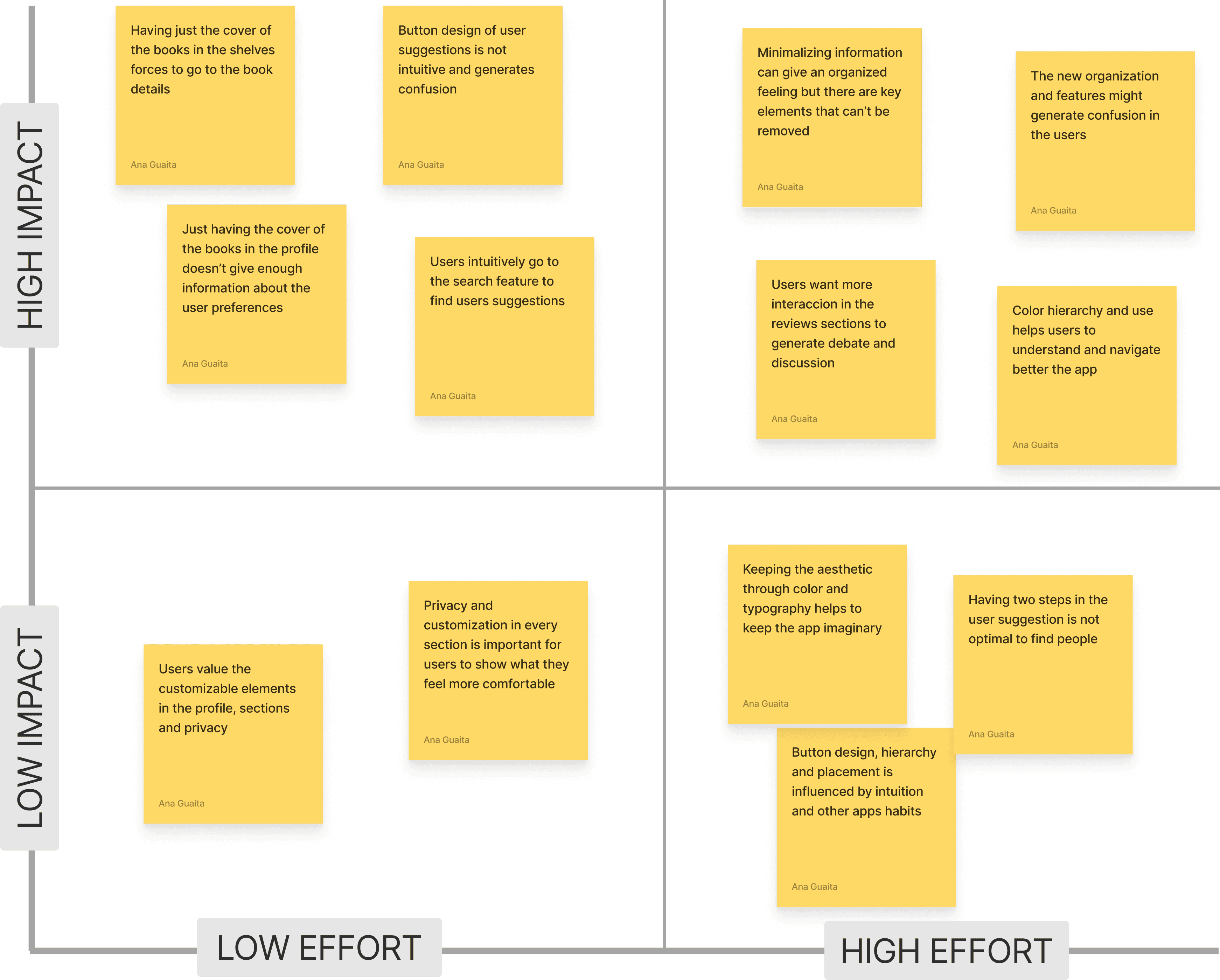
USABILITY TEST
4 out of 5 users had problems with the task of searching for users using the suggestion but in the end they managed to do it
User suggestion: Difficult to find, the tendency is to look for it in the search section
Edit description: Easy to use, bottom button has caused a bit of confusion
Edit favourite quote: No problem finding it, intuitive
Interaction with profile: Simple navigation, easier to access from the navigation bar and the new sections are interesting
Bookshelves: Intuitive, easy to use and less cluttered
Learnings and problems detected
User suggestions
Profile
Sections and features
Interface
NEXT STEPS
Most problems can be solved by modifying components of the design system
The next step would be to solve the low-effort, high-impact problems and then evaluate how to address the other problems.
REFLECTION
Every time I opened to Goodreads I said, "I can't believe that after so many years on the market, it never seems to get updated."
When I entered the world of UX/UI design, one of the first thoughts I had was: "Now that I have the knowledge, I could do a redesign that adapts to the needs I've talked about so much with my friends."
Without a doubt, one of the main challenges I faced has been understanding the general needs within an app where there are infinite types of users and each one with their objectives and preferences. But after exhaustive research and definition of the problem, I've been able to narrow down and prioritize until I found the feature that can positively impact the user experience.
After working a lot on the design, components, and interaction, I can say that it has been a constant process of finding the balance between introducing changes that benefit the user and keeping the essence of the app without making it look like a completely new one.
From the overall process, I would do more iterations at each stage of design to ensure a good experience and design, there's no need to rush! I take with me the lessons learned and improvements that could be made in the following stages of the project and how much I enjoyed doing the redesign as a designer and also a user.
OTHER UX/UI PROJECTS